3 years of training data shown through pretty diagrams
The silver lining in GDPR
The Googles, Facebooks and the Stravas of technology world have been stealthily harvesting our data for years: now, thanks to the advantage of GDPR, we as users can level the playing field and utilise this data for ourselves. Though the magic button to unlock this wealth of data is often hidden away in the dark corners of web applications, if you are happy to while away some time finding then playing with the data, it can reveal some rather cool and bespoke things about oneself. Though, on second thoughts, I’m not sure I want to know what my Tinder says about me…
Lockdown training or ‘things I will do to avoid being bored’
I, alongside many others, fell back down the rabbit hole of long distance triathlon training during lockdown. Despite vowing never to do another Ironman after my first race, boredom soon led to full addiction and an intense training program.
I would like to note at this point, as I state in my blog tagline, that I am an average triathlete. I compete in 70.3 and full distance ironman races on an age group (amateur) basis and have never podiumed in a race, but I am often towards the pointy end of my age group. In my words, average.
Admittedly however, others who know me disagree with that tag and might be more likely to use words like ridiculous or fanatical.


After a successful first year of training, I wanted to be able to look back on my time of blood, sweat and tears. A quick download of my training summary data from TrainingPeaks and some manipulation later, I put together a quick string of Instagram stories to round up the year. This proved useful as, despite the next 18 months being plagued by covid, long covid and a body that struggled with post-viral fatigue, these stories provided a great summary of my training history when the beginning of 2022 brought a new coach. I found a quick simple graph was much more effective at bringing them up to speed than trawling through years of TrainingPeaks or providing a training diary.
This was particularly shown in the beehive graph (try here at RawGraphs.io), when annotated with a couple indicators to explain gaps or variations in my training over the year, as you can tell I really enjoy swimming.
End of 2022
Stuck at home in the dead week at the end of 2022, I decided to update the beehive graph and broaden the timescales to cover the time period from January 2020 to December 2022 in the hope of being able to identify key trends or indicators from a bigger dataset.
Looking at the graph below you can see my session compliance from this time period, which covered 1350 total sessions, of which 850 were planned. When programmed, TrainingPeaks sessions are given a colour corresponding to compliance to a certain criterion (in my case +/- 20% of planned duration). Green means I completed my session within the 20% of the planned duration on my training plan, orange means it was +/- 50%, yellow is >50% and red means that no session was recorded. Conformity to a training program is a good indicator of how your training is going and the graph reflects this – from May ‘20-May ‘21 (the period covered by my Instagram stories) I was hitting >70% most of the time.
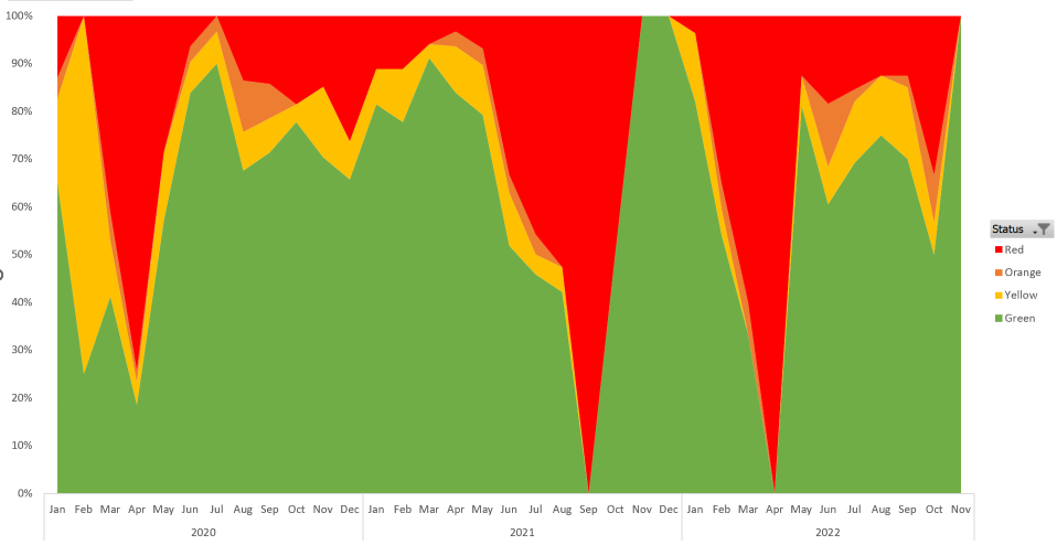
Though there are definitely some athletes out there who manage to maintain those coveted 100% compliance ‘green weeks’, for me life sometimes gets in the way and occasionally common sense plays its part and so I find that hitting >80% does me well, which is born out when you see that my best fitness was from March to May 2021.
Fast forward to the end of 2022
So, what does 3 years look like? I decided to examine a few aspects of my training, namely volume and compliance.
The first Beeswarm plot shows the total volume of my training*. It demonstrates a drop for 2022 compared with 2021 when I was training. Interestingly, when I wasn’t training between July 2021 and May 2022, the width of the swarm doesn’t change much. But perhaps that’s just a factor of the way the chart is drawn.

*Note: the shape of the bubbles is now dependent on TSS score rather than duration. This is a better marker of training as it takes intensity account and, although not a perfect scoring system, it does allow comparison between training types.
The second Beeswarm, in comparison to my Instagram stories above, is a re-look at my compliance with my training programme. There are a couple of differences with the data representation: firstly, in terms of the colours, though green/yellow/orange remain the same in terms of compliance, grey now represents unplanned sessions. Secondly, a quirk of using TSS rather than session duration means that unplanned sessions (which should be red), no longer appear as there is no TSS score recorded… doh!
Looking at it, you can see the parts of my training that are generally green. Typically, I’ve been good at complying with my run training but there is much more variation in my cycling and swim training. Interestingly, my swims come up yellow as I was completing my sessions faster than the planned time. You can see that, despite my previous reluctance to get in the pool, I did put in a decent bit of training towards the end of 2022 which I hadn’t done before. The most notable highlight for me is that it demonstrates the lower volume in my cycle training compared to 2021. I struggled with the ride on my Ironman race day as I just didn’t have the legs (though was still able to have a good day) – something to reflect on for future training.

Looking at this data statistically has been interesting and has highlighted aspects of my training that I could improve. However it also brings up the slightly meta question of whether I could improve the data interpretation itself… I think the answer is, for sure! In an ideal world it would be great to make this interactive and make it automatically update via a pipeline. Unfortunately, TrainingPeaks does not have an API that is open use. It would be cool to allow people to engage with their training peaks data and some are already allowing this (for example VeloViewer that makes use of the Strava API).
Looking back over the last 3 years has been interesting and I have enjoyed how it evidences some of my previously unarticulated thoughts